Key questions when setting up UX filtering
- What algorithm should be used for an agile UX filter to sort e-commerce products?
- What data should be collected in order to evaluate the performance of product sorting?
- How does the availability of products and UX filtering affect sales?
- How can you save time by promoting products displayed at the top of categories?
- What positive results can be accomplished by automated sorting?
Filtering UX: Lack of sorting e-commerce products leads to loss of customers
Have you ever spent hours browsing for your favourite piece of clothing, just to realise you cannot find the right size to fit you?
After checking the fourth or fifth jumper that you absolutely love, you abandon the search as you are fed up of wasting your time on a website that may offer nice products, but all popular sizes are out of stock.
And then, to make matters even worse, the same products (not available in your size) follow you through remarketingRemarketing is the repeated display of targeted ads to potential customers based on their previous interactions with the site. Learn more now. More campaigns on Google, Facebook, and other channels.
Build your sorting UI based on stock levels of e-commerce products
First of all, you need to optimise your inventory and decide on the optimization process. Therefore, you need to collect data to determine the scope of your problem.
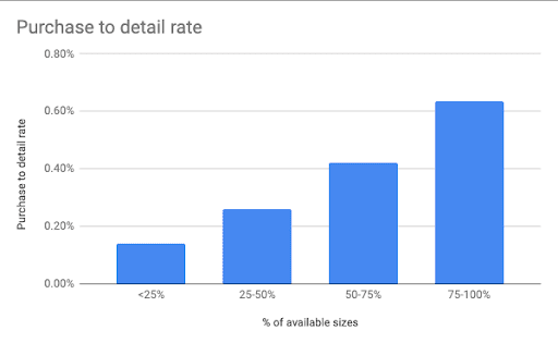
The X-axis is the percentage of available sizes of the product. This number tells you how many sizes of one product are in stock.
This product has a total of 10 sizes, but only 8 of them are in stock. The resulting value is 80% and falls in the last column of 75-100%.
The X-axis indicates the ratio between the purchase and the display of the product (or the percentage of available sizes). Thus, it expresses the extent to which people buy the product against how many sizes were available at the time. We call it the “conversion ratio from product detail to purchase”. For comparison, the graph also states the result if a product had 100% of available sizes:
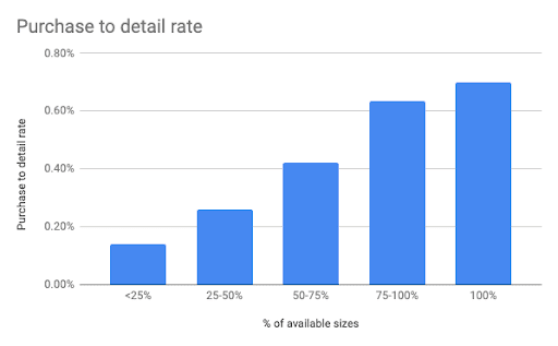
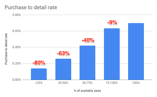
The graph shows that the difference between the 75-100% group and 100% group is not that big. When we compare the difference between the “conversion ratio” at 100% of sizes with the rest of the results, we see that anything below 75% means a significant, 40-80% drop in conversions. This should ring alarm bells for the client. See the following chart:
The take-away and the conclusion
Dexfinity will experiment with the sizes we advertise on ad platforms. We would aim to get rid of ads for the group with an availability rate of <25%. We would then experiment further with groups of 25-75% and 50-75%, and conduct tests whereby we shut each one down in turn within advertising campaigns.
Would you like Dexfinity to analyse your online store? Contact us and we will be happy to help.
Build your UX filtering based on your bestsellers
Information about what sizes are sold in each category is statistically extremely significant and your filtering UX should reflect it.

Let’s delve deeper into the data, as you might see that there are different ‘size-winners’ among products for men, women, and children. We have to keep in mind that jumpers (S-6XL) and shoes (35-47) have their own numbering. To complicate matters further, manufacturers also tend to use different numbering and sizing. Let’s take data on the largest category as an example. Men’s jumpers come in standardised sizes and are kept in order in the database. If we obtain correct data from Google Analytics, we can create a custom report to get all the way down to the category of Men -> Clothing -> Jumpers and see the sales by size:
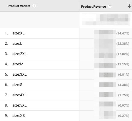
Here, we can see that our ‘favourites’ in the men’s category are sizes M, L, XL and 2XL, which have 85% of all sales in this category. In combination with the findings on available sizes in point 1 ‘Size Availability Data’, we should consider the following:
- Does it make sense to advertise on products with 50% availability, but with the only available sizes being S, 3XL, 4XL, 5XL and 6XL?
- Does it make sense to display ‘Men’s cycling tops’ at the top of the page when available sizes are S, 3XL, 4XL, 5XL and 6XL?
If you answered NO to both questions, read on. Take a look at an example on the graph below, the results of which can be achieved by applying the correct sorting of products in the category and stocking of goods.
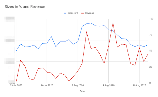
As you can see on the graph, around the 4th of August, quite a significant number of products were stored in the online store. Prior to the 4th of August, the stock was at 60-65%. On the 3rd of August, it rose to 88%, peaked at 93% and gradually started reducing on the 10th of August back to its previous level of 60%. The question is: How is it possible that sales didn’t fall back to their previous level after the 10th of August? The answer is: data-driven agile UX filtering.
Data-driven agile UX filtering
On the 4th of August, we implemented a particular algorithm for sorting products within their categories. The products were originally sorted in their category according to the parametre of ‘most recent’.
If we wanted to, say, promote certain products at the top of the page, the date of product addition would be set to display as 2025. This system worked well, until we started targeting 2-3 countries and we had multiple active categories. In practice, what happened was that the products that were at the top could not be checked at the start of the season and the client had to change these dates manually. This means that there were still some products at the top of the page which did not have many sizes available. The number of such products increased during the course of the season. This resulted in lost turnover and a disappointed customer. We also have to keep in mind that different products are sold in different countries. Sagan’ cycling jersey, as Slovak cycling champion, does not sell in Slovenia, Hungary, Poland, Romania, the Czech Republic or England. We can only sell it in Slovakia.
We decided to solve this problem with an algorithm. The algorithm takes into account the following parameters:
- Total sales of all product variants
- Current availability of product variants
These two metrics are multiplied and sorted in descending order. We also took into account the following:
- The products are listed separately for each category and the last subcategory
- The products are sorted separately for each country
- If a country does not have enough data, we take into account data from other countries
- Sold products are followed by new arrivals
Sorting of TOP products from the latest collection
As we are in the fashion business, we need to make sure that pieces from the latest collection come to the fore. Alternatively, we would need to promote products that are interesting particularly thanks to cycling events. For this purpose, we invented the sorting of Top products for this occasion. Here, we are able to easily choose specific products within the online store administration. And, most importantly, products can be inherited. This means that I can choose jumpers, trousers, leggings, jackets, gloves for the entire category. But, only a product from that given category will be displayed in a specific category. In practical terms, at the time when the Tour de France was imminent, we wanted to promote green, yellow and dotted cycling jerseys.
UX filtering results (driven by this particular algorithm)
NOTE: Results cover a period of 2 weeks across 10 domains and countries (Slovakia, Czech Republic, Poland, Hungary, Romania, Slovenia, United Kingdom, Netherlands, Belgium and Denmark). We compared the results with the previous period of 2 weeks.
CTR (clickthrough rate)
We measured whether the ratio of clicks to impressions would change. We looked at the ratio of the number of product impressions per category to the number of product clicks per category. The results that came in were surprisingly strong. Clickthrough rate increased by 11.7%. This could be due to the customer finding a product that is larger in size or more likely to be liked.
CR (product impression to purchase ratio)
After the algorithm was deployed, this ratio increased by 7%. This is a great number for an extensive test on 10 domains. The variance is at the level of -8% to + 21%. -8% was the only negative value.
Availability
One particular factor that affected the metrics was mentioned above. The number of products that had an availability of 75-100% was originally 63%. After the deployment of the algorithm, the number of products with the largest selection of sizes (75-100%) stood only at an average level of 55%. A decrease in stock should mean a reduction in the conversion rate. Instead, the conversion rate grew during this period.
Time taken by the client
Thanks to this solution, the time that a client has to dedicate to this has been minimised. Instead, they can use this time to provide customer support during a period of pressure due to high order volumes. Our mission is to help online stores grow. Therefore, we do our best to ensure that the sale of products does not stop due to something that we can influence. And that’s why we’re constantly improving processes, writing scripts and looking for effective solutions. We have a whole host of them, so contact us and we will be happy to help streamline the performance of your campaigns.